 |
| Figure 1. Frequency of events for user ecenergy22 |
 |
| Figure 2. Frequency of events for user ecenergy23 |
 |
| Figure 3. Frequency of events for user ecenergy24 |
 |
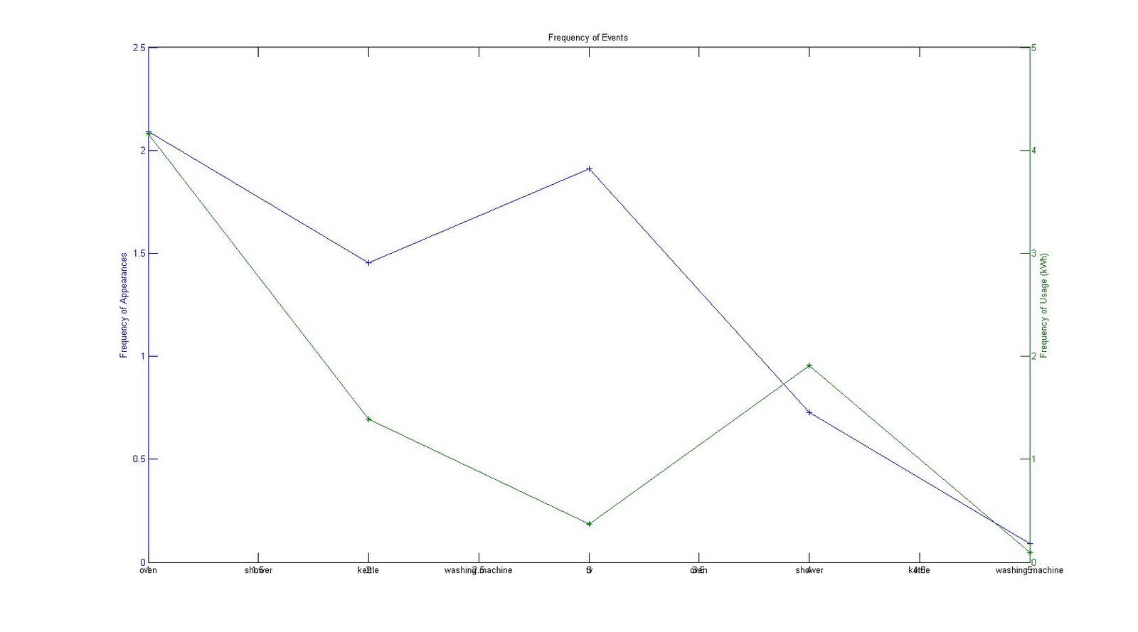
| Figure 4. Frequency of events for user ecenergy25 |
 |
| Figure 5. Frequency of events for user ecenergy30 |
 |
| Figure 6. Frequency of events for user ecenergy33 |
 |
| Figure 7. Frequency of events for user ecenergy34 |
 |
| Figure 8. Frequency of events for user ecenergy36 |
Hi Henry,
ReplyDeleteThank you for posting this.
A minor thing: these are not time series, so it does not make sense to use a line plot. In these cases you should use bars (see http://www.mathworks.co.uk/help/techdoc/ref/bar.html )
Turning to less mundane issues: what are the two colours? Are they week-day and week-end again? If so, how did you calculate things with the week-end gaps?
Did you read again about Poisson distributions, yet? Do you see how you could relate this frequency data to those distributions? And especially their parameter estimation and prediction?
I know right now you are working with very little data, so I do not expect very good results, but if you develop the methods (and more important the understanding) it should be easy to plug more data later..
Can you please also try to plot these frequencies for all users together?
Yes I need to turn them into the bar graph.
ReplyDeleteI use multi-dimension y scale axes. As you can see from the graph, each colour represents for different frequency. The blue line is for the frequency of appearances of events. The green line is for the frequency of event usage.
Yes, I think the frequency of events could be related to Poisson distributions. Additionally, FigureEnergy data can be divided into two themes: labels, and usage. I now try to set up a list of threshold of usage, then I might try to apply Poisson to estimate the probability of the threshold which could be at the given time step t'.
Hi Henry,
ReplyDeleteI do not understand what you mean by "event appearance" and "event usage" -- can you pleas explain?
> I now try to set up a list of threshold of usage,
> then I might try to apply Poisson to estimate
> the probability of the threshold which could
> be at the given time step t'.
Sounds good! I look forward to see this.
The event usage is actually the everage consumption for the specific event type.
ReplyDelete